Playing with Machine Learning and Data Visualization using Orange 🍊
Hello! Have you ever wanted to try out machine learning or data visualization but felt overwhelmed by complicated code and complex equations? Well, you’re in luck! There’s a wonderful, free, and open source tool called Orange that makes these exciting fields easy, fun, and incredibly visual. Think of Orange as a colorful playground where you can build powerful data science experiments without writing a single line of code.
What is Orange? And Why is it so Playful?
Orange is a software suite for machine learning and data mining. It’s developed at a university in Slovenia, and the best part is that it’s completely open source, meaning everyone can use it, share it, and even help make it better.
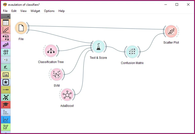
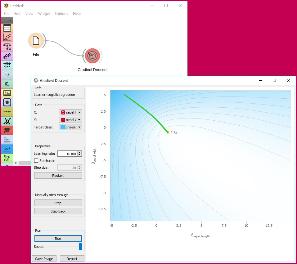
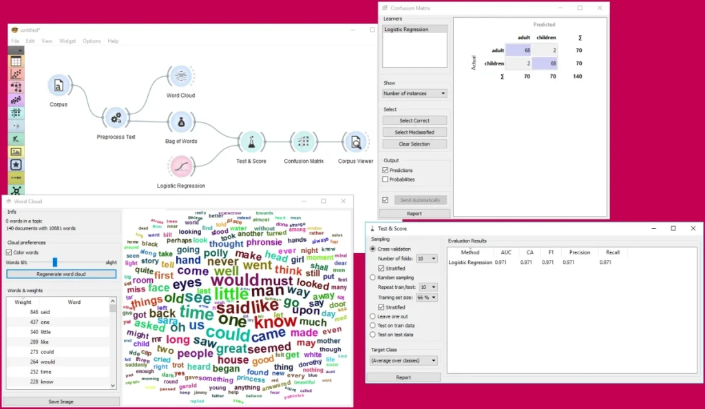
The reason Orange is so “playful” is its design. Instead of using text commands and code, Orange uses a visual programming interface. This means you work with small, colorful boxes called widgets. Each widget performs a specific task, like loading a file, showing a graph, or training a machine learning model.
Imagine you are building with LEGO bricks. In Orange, you drag these widget “bricks” onto a canvas and connect them with lines, creating a workflow or a data pipeline. The lines represent the flow of data from one step to the next. This approach makes complex tasks intuitive and easy to understand at a glance.
Getting Started: Your First Orange Playground
To start playing, you just need to download and install Orange on your computer. It’s available for Windows, macOS, and Linux. Once you open it, you’ll see a blank canvas—your personal data science lab!
Let’s try a simple task: loading some data and looking at it.
- Load the Data: You start by dragging a File widget onto the canvas. This widget is where you tell Orange which data set to use. Orange comes with many built in sample data sets, like the famous Iris flower data set, which is great for beginners.
- Inspect the Data: Connect the output of the File widget to a Data Table widget. As soon as you connect them, the data flows! Double click the Data Table widget, and you’ll see all your data neatly arranged in rows and columns, just like a spreadsheet.
- Visualize the Data: Now, let’s make a picture! Data visualization is crucial because our brains understand patterns in images much better than in numbers. Connect the File widget to a Scatter Plot widget.
The Scatter Plot is one of the most playful visualizations. It lets you see how two different features (columns) in your data relate to each other. For example, in the Iris data, you can plot “Petal Length” against “Petal Width.” You’ll immediately see clusters of points, which usually represent the different species of the Iris flower. Seeing this structure visually is the first step in understanding your data and preparing for machine learning.
Other great visualization widgets include Box Plot (to see the spread and typical range of a feature) and Distributions (to see how frequently different values appear). Each visualization helps you discover something new about your data.
The Machine Learning Funhouse
Data visualization is fun, but the real excitement comes with machine learning. Machine learning is about teaching a computer to learn patterns from data so it can make predictions or decisions on new, unseen data. Orange makes this incredibly easy.
Let’s try to build a simple classifier—a model that can sort things into categories (like deciding if a customer is likely to buy a product or which species a flower belongs to).
The Classification Workflow
- Prepare the Data: Start with your loaded data (File widget).
- Split the Data (Training and Testing): The secret to good machine learning is testing your model on data it has never seen before. Drag the Data Sampler widget onto the canvas. You can set it to split your data, for instance, into an 80% training set (what the model learns from) and a 20% test set (what we use to check its accuracy). This is an essential step in preventing overfitting, where a model becomes too good at predicting the training data but fails on new data.
- Choose Your Models: Now for the fun part: picking different machine learning algorithms! Orange has widgets for many popular techniques:
- Tree: A simple model that makes decisions based on a series of “if then else” rules, like a flowchart.
- Logistic Regression: A classic statistical model used for classification.
- k Nearest Neighbors (kNN): A model that classifies a new data point based on the majority class of its k nearest neighbors in the training data.
- Train the Models: Connect the output of the 80% training set from the Data Sampler to the input of all your chosen model widgets (Tree and kNN). In a flash, Orange uses the training data to teach each model.
- Test and Compare the Models: This is where we see which model performed best. Drag an Test and Score widget onto the canvas. Connect the test set (the remaining 20% of the data) to the input of Test and Score. Crucially, also connect the output of all your trained models (Tree and kNN) to the Test and Score widget.
Double click on Test and Score, and Orange shows you a neat table comparing the performance of all your models. You’ll see metrics like Accuracy (the percentage of correct predictions), F1 Score, and AUC. This visual comparison lets you easily choose the best model for your specific problem.
More Advanced Play: Unsupervised Learning
Machine learning isn’t just about prediction (called supervised learning). It’s also about finding hidden structure in data without any labels (unsupervised learning). Orange makes this fun, too.
Finding Groups with Clustering
A popular unsupervised technique is clustering, where the computer finds natural groups (clusters) in the data.
- k Means Widget: Connect your data to a k Means widget. This widget is one of the most famous clustering algorithms. You tell it how many clusters you want it to find (e.g., 3).
- View the Clusters: Connect the output of the k Means widget to a Scatter Plot. In the Scatter Plot settings, you can now color the data points based on the “Cluster” that the k Means algorithm assigned them to. Immediately, you’ll see your data points separated into different color groups, showing you the hidden structure the computer discovered.
Simplifying Data with PCA
Sometimes data has too many features, which makes it hard to visualize and slows down machine learning. Principal Component Analysis (PCA) is a trick to reduce the number of features while keeping most of the important information.
- PCA Widget: Connect your data to a PCA widget. This transforms the data into a smaller number of “principal components.”
- Visualization: Connect the output of the PCA widget to a Scatter Plot. Now you can plot “Principle Component 1” against “Principle Component 2.” This gives you a powerful 2D view of your high dimensional data, often revealing patterns that were previously invisible.
The Power of Open Source and Community
Orange’s playful nature is deeply connected to its open source foundation.
- Free for Everyone: Because it’s open source, it costs nothing to use, making advanced data science accessible to students, small businesses, and enthusiasts worldwide.
- Trust and Transparency: You can see the code behind every widget. There are no hidden tricks, which is crucial for science and learning.
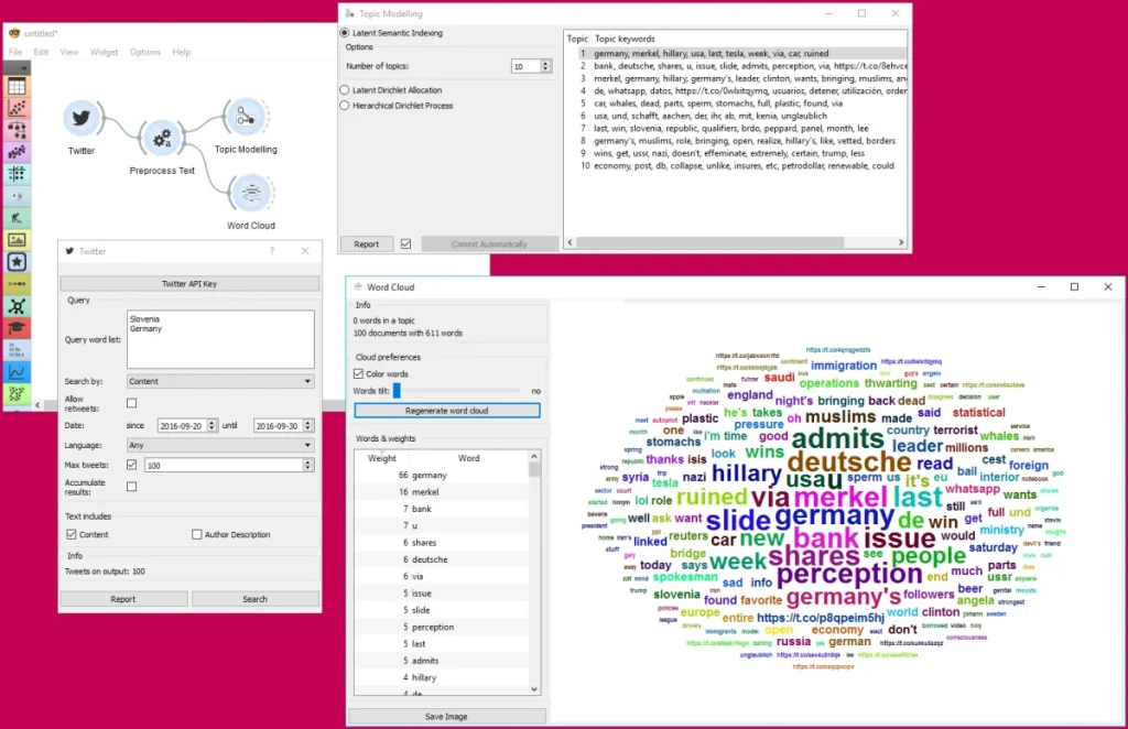
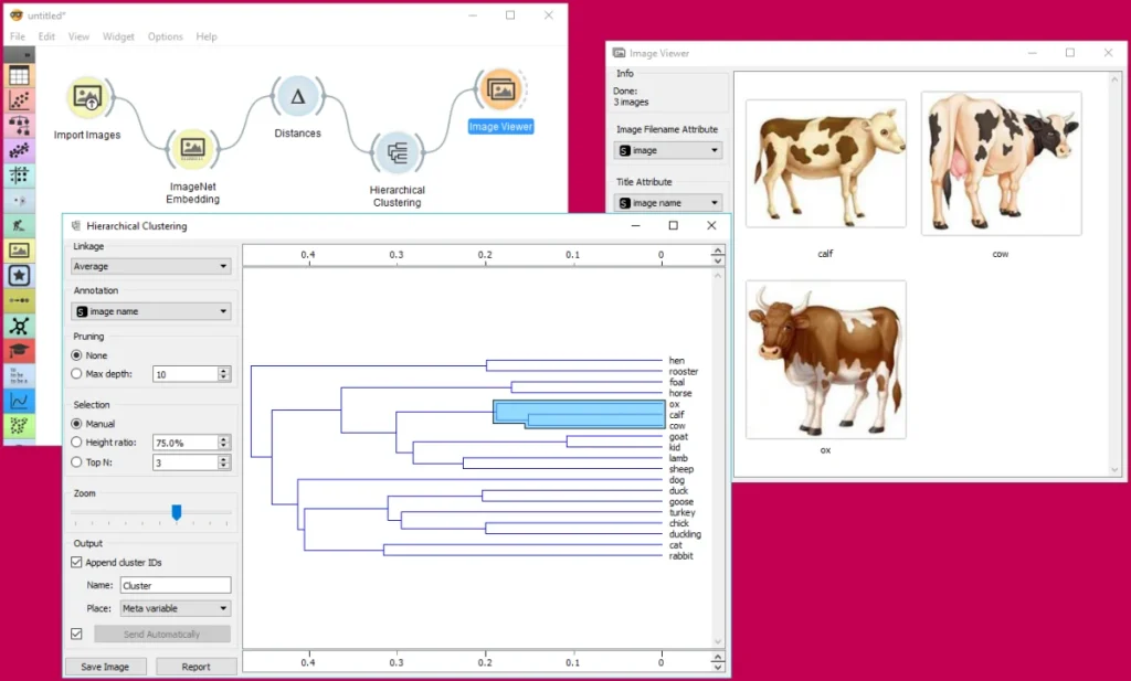
- Extensions and Community: The Orange community is vibrant. People build and share add ons (like new sets of LEGO bricks) that extend Orange’s capabilities. These extensions cover specialized areas like text mining, bioinformatics, network analysis, and image analytics. If you are interested in, say, analyzing the words in a collection of documents, you simply install the Text Mining add on, and a whole new set of playful widgets appears!
TL; DR Data Science for Everyone
Orange truly is the most playful and approachable way to dive into the world of machine learning and data visualization. It removes the need for complex programming, letting you focus entirely on the data and the results.
Whether you are a student learning the fundamentals, a business analyst trying to understand customer trends, or just a curious person who wants to see what their data is hiding, Orange provides a fun, colorful, and powerful environment. It turns the often difficult subject of data science into a hands on, visual game of connecting the dots.
So, go ahead and download Orange. Start dragging those widgets, connecting those lines, and uncover the beautiful stories and powerful insights hiding in your data! The data science playground awaits!
I hope this playful introduction inspires you to explore data science with Orange.

